illumy isn’t just an email address, messaging tool, and calling app in one. It’s also a place to share your personality.
Just like a social network, your illumy account includes a fully customizable profile page to highlight what matters to you: whether that’s your alma mater, your favorite sports teams, or your hobbies.
Maybe the most important part of your illumy profile is your personal photo — since, let’s be honest, it’s the first profile element that most people will notice. (Research into dating apps shows that personal details aside, your main photo is what gets noticed first.)
Here, we’ve collected some professional photographer advice to get a good profile picture and let your personality shine through.
Try to use natural lighting.
Nothing against artificial lighting, but natural light is more realistic. That matters if you’re trying to put your best foot forward and present an authentic profile image.
“Natural lighting is more appropriate when capturing an intimate, genuine vibe,” the New York Institute of Photography says.
Natural light has another benefit — it’s totally free. You can play around with it by taking photos inside and outside, and at different times of day, to capture your current mood and get the best version of yourself on film.
Keep in mind that if you do go outside, direct sun is going to wash you out (and make you squint). Shade, on the other hand, makes for good lighting.
If you rely on a flash, bounce it.
Artificial lighting does provide one big advantage over natural light: more control. You can set the brightness or color balance exactly as you like.
Still, a flash pointed directly at your face will blow out the photo and make you look flat. Instead, experts say, you should bounce the flash for high-quality images.
“Aim your electronic flash straight up [or] tape a piece of white cardboard at an angle so the light bounces up and off the cardboard,” communications professor Ross Collins suggests.
A cheap camera and free editing tools will work just fine.
Today’s smartphone cameras are really good. Entire films and professional photo shoots have been captured on phones, at a quality level that’s pretty close to pro cameras.
In capturing the right profile photo, a smartphone camera is more than sufficient. Your phone may also have a portrait mode that softens the background to make your face stand out.
Even if portrait mode isn’t an option, your smartphone likely comes with onboard photo editing tools that let you change the exposure, contrast, or other design elements. Free apps like Snapseed (iOS, Android) offer additional editing options if your built-in photos app doesn’t cut it.
One pro tip when editing: crop your profile picture so it takes up about 75% of the frame. That may seem extreme, but it will make your photo stand out much better on other people’s screens.
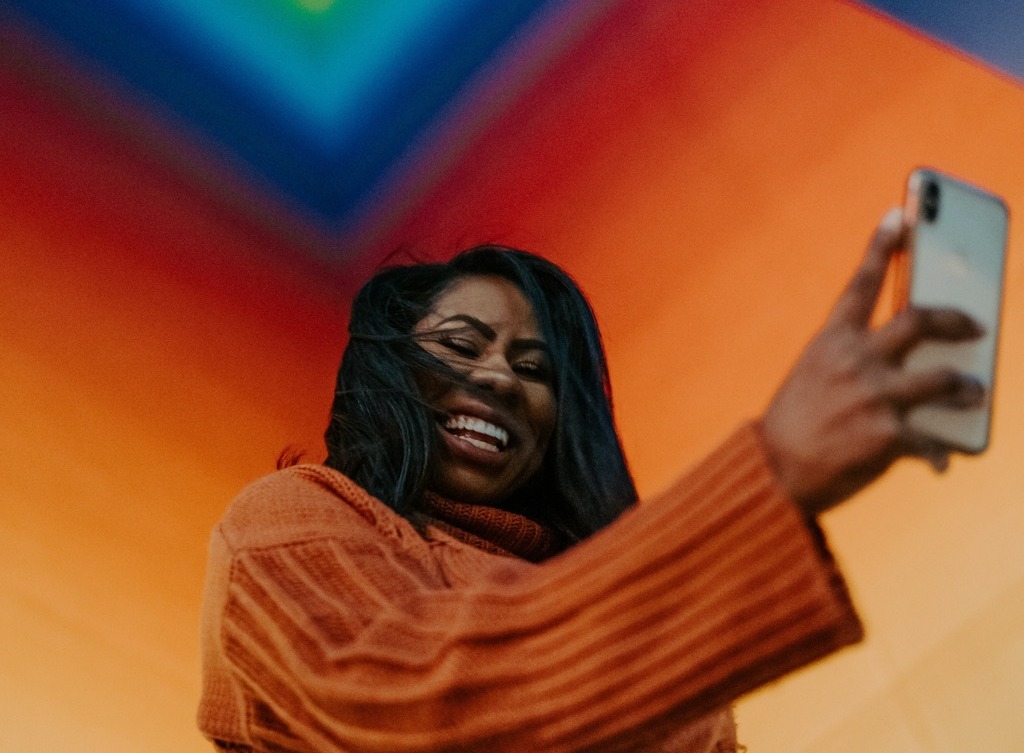
Selfies are A-OK, too.
It’s weirdly embarrassing to be seen taking a selfie. But when the goal is to get a great shot of yourself, sometimes you’re going to be your own best photographer.
Capturing a good selfie takes some planning. Career counselors suggest you have:
A neutral background. In your profile pic, you should be the focus (duh). That means picking a background that won’t distract.
A light source that’s offset. The camera lens should be positioned parallel to the background, but you don’t want the lighting to be parallel as well. Lighting at an angle is more flattering.
A 45° turn. You’ll want your body to face the light source, but your head to be turned toward the camera. A 45° angle is good; any more than that could make you look like you’re straining your neck.
A slightly raised camera. To limit shadows from being cast on your neck, raise the camera slightly above eye level. A selfie stick or tripod can make a big difference.
Be mindful of color theory.
Believe it or not, there’s a science to color. For that we have Isaac Newton to thank. In 1666, while quarantining from a plague, he learned by experimenting with prisms and mirrors that white light consists of three primary colors.
Combining these colors produces secondary colors, and combining primary with secondary colors generates tertiary colors. All of these can be arranged on a color wheel, which provides a kind of cheat sheet for identifying which colors look good together.
There are three ways of interpreting the color wheel for better color combos:
Complementary colors. No, not complimentary — although we hope your new profile picture is good enough to get complimented. Complementary refers to colors on the opposite side of the color wheel. They’re a good pick if you want your image to stand out.
Analogous colors. Analogous colors are next to each other on the color wheel. Because they flow nicely into one another, they’re pleasing to behold. That can help you project zen or harmony in your image.
Triadic colors. Imagine an equilateral triangle in the middle of the color wheel. No matter how you spin the triangle, the three points are touching triadic colors. These colors are clearly defined when presented together, providing for a striking image.
The color wheel is a powerful tool for selecting a background or attire for your profile photo. The wheel can also help you dress for your skin’s natural undertone.
According to cosmetics pro Aimee Morrison, there are two hacks for identifying your undertone. First, look at the veins on the inside of your wrist: Blue veins map to a cool undertone, while green ones map to a warm one. Second, think about whether you prefer silver or gold jewelry. Silver is better suited to cool skin tones, while gold looks better with warm ones.
Hopefully these tips will help you take some cool pictures, capture your personal brand, and edit profile photos to your liking!
Photo by Brittani Burns on Unsplash.


